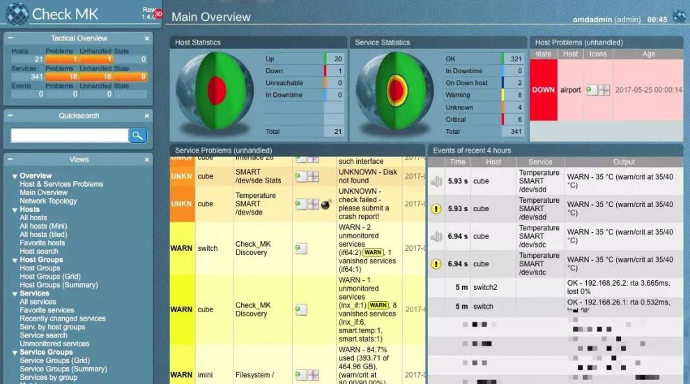
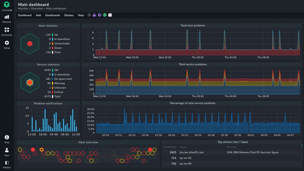
Last March we released the new Checkmk Version 2.0, which set a new record for the number of improvements implemented in a major release. Log in to Checkmk and you will immediately see how dramatically it has changed, as improving the user experience has been one of our priorities for this release.
Developing this improved user experience wasn’t simply a walk in the park – it was a product of the collective effort not only of the team at tribe29, but also by the Checkmk user community who tirelessly shared their pain points, feedback, as well as testing our prototypes and beta releases. In this blog I’m going to share with you some of the highlights of the process of crafting the new user experience that you can now see in Checkmk 2.0.
Defining our primary areas of focus
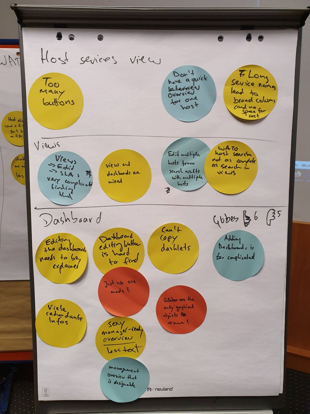
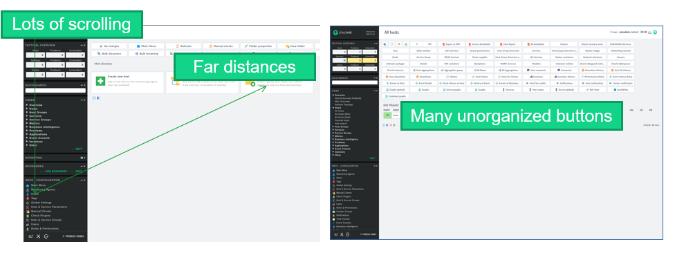
The overhaul of the Checkmk UI began in January 2020, when our team started gathering input from users regarding the then state of the Checkmk user experience. Some of the early feedback came from the 2019 Partner Day, when Checkmk Partners were able to share their pain points on the then current version of Checkmk (version 1.6). We also held workshops with some of our clients who use Checkmk to monitor their large infrastructures – some of which can have over 1 million services.
We spent a significant amount of time identifying user problems and analyzing user behavior when navigating within Checkmk. During the conceptualization process, we defined four basic types of user as follows:
- Monitoring administrator – a user involved with all hosts, who will most likely turn into a power user
- Special administrator – a user involved with only one host type (e.g. database), one who will probably reach an advanced level, but not become a power user
- Application engineer – a user who looks at a host as part of the application, and one who will likely always be on a beginner level with Checkmk
- Helpdesk staff – Users who need to view information in Checkmk but who are less likely to make any actual changes in a monitoring.
From the process of gathering feedback, it became clear that the following would be the points we would focus on:
- Making it easier for beginners to use Checkmk while not disrupting the workflow of expert users
- Making it easier for the user to find what they need and quicker for them to get there
- Creating a clear separation between ‘Setup’ (e.g. which hosts and services in your infrastructure are monitored by Checkmk and who has access to the monitoring, etc.) and ‘Customization’ (the presentation of the data in the monitoring via views, dashboards, etc.)
- Modernizing Checkmk’s overall appearance
Developing the new navigation bar and search function in Checkmk
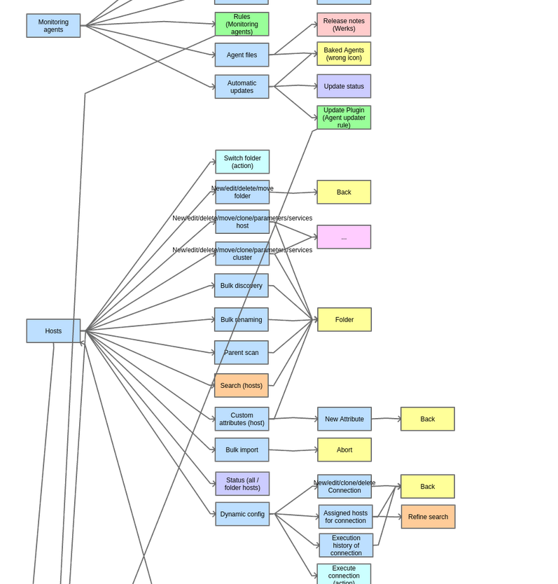
Ease of navigation was one crucial element to address under our areas of focus. Improving the navigation will make it easier for new users to get used to the many features of Checkmk. Power users will equally benefit as it reduces the steps in their usual workflow since they’ll be able to find what they’re looking for more quickly. The task of conceptualizing the new navigation in Checkmk proved to be challenging, as we had to deal with the complexity of Checkmk’s extensive range of capabilities. We also had to determine how to organize all of the configuration options so that that these would best support our users' workflows.
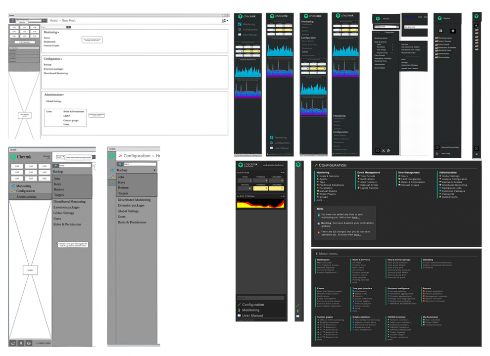
Our goal was set to have one master navigation bar that is used for navigating in Checkmk. We experimented with various layouts using 'wireframes' and mock-ups, trying different combinations of navigation positions and how the navigation items could be organized.
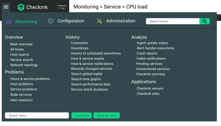
Initially, the navigation bar concept included the Global Search (as shown in the image below). We later removed this because we determined that it would be better if a user could see the results on the fly without leaving the page and can also abort the search if he is not happy with the result. This is why we included the search within each ‘mega menu’. The reason for this is that a user usually knows what they want to do (e.g. search in the monitoring, customize some views, rework the setup).
Making the search work only for the selected mega menu will produce results closer to the user’s query since it specifically searches only the items under that group. With a global search, we would have to show a separate page with all of the possible results that can come from the search. This would be frustrating for power users who are used to the Quicksearch of the old Checkmk version as it is an additional interaction. Additionally, with the mega menu search you can use the arrow keys and enter to select and navigate to the desired result.
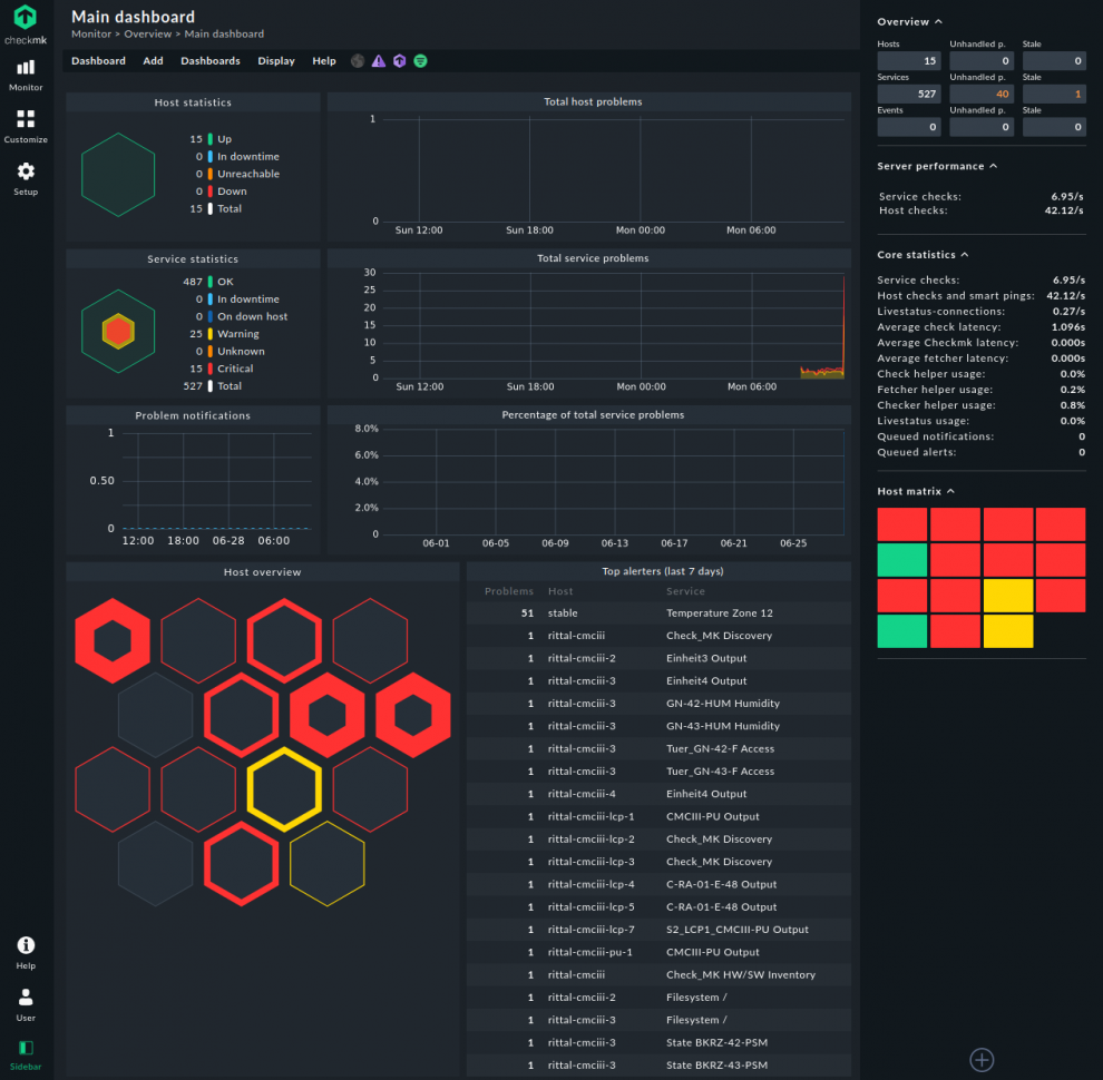
After careful research, testing and feedback gathering on the position of the new navigation bar, our team determined that the best approach would be to have two sidebars on Checkmk; Navigation on the left, and a monitoring statistics Overview on the right. The right sidebar will be used for status data (e.g. tactical overview, microcore performance). This can be hidden to have extra space for the data.
A good navigation isn’t complete by simply having all of the important options enumerated. We also needed to think about how to provide graphic cues to our users in the form of icons, so that they will be able to immediately recognize the option they are looking for. Other than deciding on a consistent icon style to be used (multicolor vs single colour, for instance), an icon's placement in the navigation was also evaluated. Moreover, it was considered whether it would be helpful to assign a colour per topic group. With this, even with different icons, users can associate them with the group that an item is under.
For the mega menu under the navigation bar, at Checkmk Conference #6 we ran a survey to determine whether icons should be provided per topic (e.g. Overview), or per navigation item (e.g. Main Dashboard). The results showed an equal preference for the two options, hence we decided on the neater format of defining an icon per topic as the default, but also that the user could specify the icons per navigation item under User ➳ Edit profile. For the ‘icon per topic’ format, we used a unicolor icon for each group and below it is simply a list of items that fall under the group.
Considering the long list of options in Checkmk, we also introduced a ‘show less’ and ‘show more’ feature on the mega menu, so as not to overwhelm those who are not yet experts and make it easier to scroll through and click the option you need. The ‘show more’ option is the default for those who update from an older Checkmk version, and this can be customized under the Global Settings and in a user's Edit profile settings. The Checkmk admin defines the default and the user can overwrite it as required.
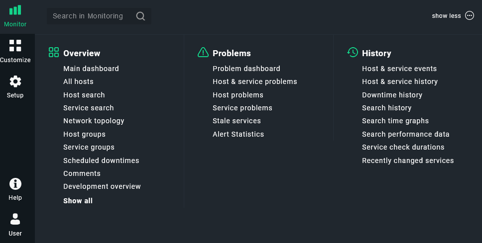
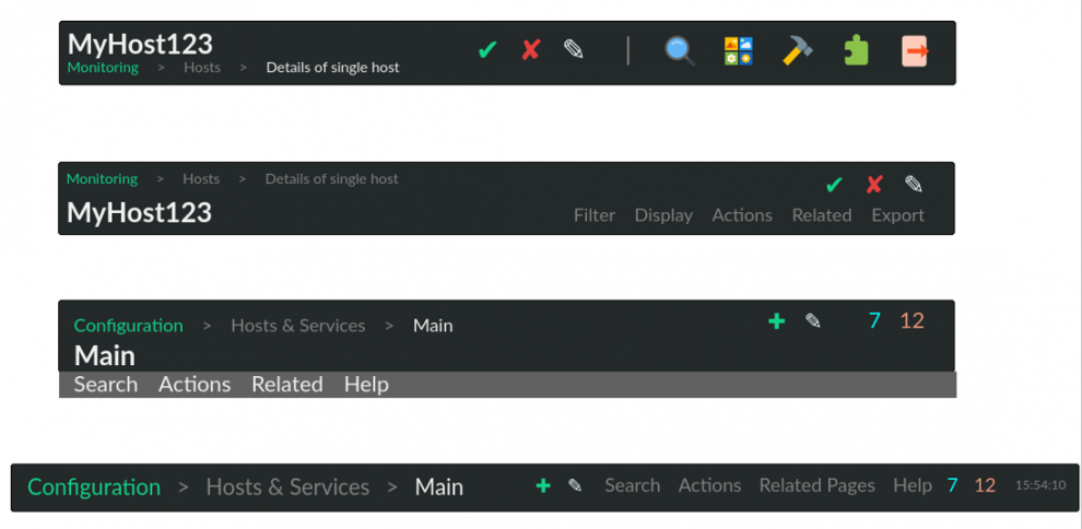
In addition to the new navigation bar, having a concept of helpful page info and the search function will also help users to quickly find what they need. For this the use of 'breadcrumbs' in the Checkmk UI was conceived, which gives the users an idea of their current location and how they can go back to the parent page/s of their current page.
Checkmk has the Quicksearch function which is primarily used for searching hosts and services. We received input from the Partner Day regarding the idea of having the capability to search for rule sets as well. This opened up the idea of having a ‘Setup Search’ under Monitor. Other than searching for the rule sets, we also extended it to other areas such as global settings, hosts in the setup and event console settings.
Graphs and metrics
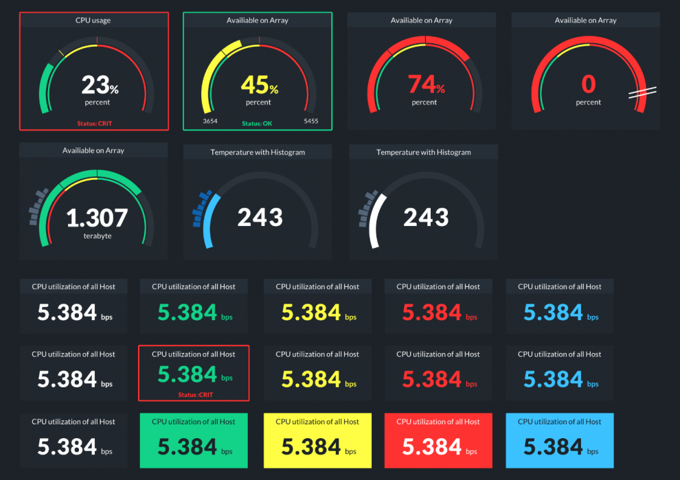
Improved graphing, better dashboards and new dashboard elements (dashlets) were topics that we tackled in the later part of the process. We believe that enabling users to have access and support in creating great dashboards not only helps them visualize their data, but also helps them to communicate better with their stakeholders.
The dashboards used prior to version 2.0 were primarily based on tables. Although this is great for providing details to IT admins (e.g. a list of all current problems), it is not the best method to get a good monitoring overview for applications, Docker or Kubernetes setups. For that, we need dashboard elements to:
- Show single metrics (e.g. in a graph or a gauge)
- Have multiple elements (e.g. bar plots for Docker containers by CPU)
- Show correlations (e.g. average scatterplot)
- Show the status of a single service (planned for a later release)
- Show the status of multiple services, e.g. X/Y services OK (planned for a later release)
Having drilldowns through various dashboards is an important feature as well. For example, these are implemented when you have an installation with multiple sites, where you’ll see a site overview in the main dashboard. If you click on a particular site you’ll be shown a site-specific dashboard with an overview of all of its hosts.
The new dashboard elements that you see in Checkmk 2.0 were conceived based on those needs.
Finally, we also made the difficult decision to retire the famous Checkmk globe. We introduced the new hexagon format to show Hosts and Service Statistics, which now completes the modern look of Checkmk 2.0.
Refining the details
In particular, fine-tuning the details of themes required a significant amount of time. For the new dark and light theme we had to ensure that the look is consistent across both. We needed to choose the right icons to provide the proper context for the option being represented, with a consistent style and color. Prior to Checkmk 2.0, the icons that we used were of different colors that didn't give clear hints to the users for help in searching for what they needed.
Implementing a new user experience, especially with the aim of adapting the look of the software to modern times, also involved moving away from the Classic theme. This initiative isn’t as simple as it sounds, as we have to ensure that Classic theme users can readily adapt to the new themes that will have replaced the old ones.
Terminology is another topic that we deemed it important to simplify, in order to make it easier for beginners to become familiar with the product. We had to let go of some Checkmk-specific terms, for example WATO and Multisite, so that the terms we now use are more generic and thus immediately understandable by any user.
The Release of 2.0 the and Next Steps
Following a couple of months of anticipation, the Checkmk community was finally able to try the new UX in the 2.0 beta, and we ran a survey to get their opinions on the new experience. A majority of the respondents supported the changes and commented that what we came up with really brings a significant improvement compared to the previous versions. We did some fine-tuning based on that feedback, and the new version was finally ready for release in March 2021.
We accomplished such a big task in a short time for Checkmk 2.0, and we have many more items on our wish list for the user experience in the next major release. Some topics we intend to address will be bookmarking, searching in the Customize menu, and improving configuration workflows in Checkmk.
If you would like to learn more about what’s coming next for the UX, watch this presentation from this year’s Checkmk Conference.
