We mentioned it again and again in the latest blog posts regarding our Checkmk Conference #6: We want to make it easier for you to use Checkmk. This means that on the one hand we want to flatten the learning curve for beginners, and on the other hand we want to make it easier for experienced users to use our monitoring solution on a daily basis.
At the conference, tribe29 founder Mathias Kettner showed the participants how we want to improve the Checkmk user experience (UX). Due to the many features that have been added over the years, Checkmk has become increasingly complex. This makes it particularly difficult for beginners to get started. It is therefore a matter that Mathias has taken to heart – to make the user experience with Version 2.0 of our software more intuitive.
For this, the Checkmk team looked at the areas of the software whose simplification would have the greatest impact on the UX. However, we did not only rely on our own gut feeling, through surveys we also gained feedback from our users – for example, at last year’s Checkmk Conference #5 – or through our own consultants. We will continue to do this in the future, as soon as we have completed the first concrete improvements.
An important point is, for example, the question of navigation in Checkmk, and thus one which specifically-affects the sidebar, as Mathias found. The sidebar provides the user with important current information – for example, via the Tactical Overview. But the sidebar also helps a user to navigate in their own Ch
eckmk environment. Another advantage is that the sidebar can be expanded with various snap-ins, and its design can be tailored according to an individual user’s needs. A disadvantage, however, is that the sidebar quickly becomes crowded, and users frequently have to scroll to get to the desired menu item. Many find this not user-friendly, Mathias summarized.
Another point that we want to look at are the so-called ‘context buttons’ in the various menus. These should enable the user to quickly carry out relevant actions in the context of the menu interface that is called-up. Their current disadvantage, however, is that they have a limited length of text for explanations, and that they consume vertical space on each page. According to Mathias, many beginners also lose track of where they are in their Checkmk environment because the page they have called-up has no breadcrumb.
Powerful Search Functions
The Quicksearch in Checkmk will be improved as well. So far, it has enabled users to quickly search for commands, hosts, etc. in their environment. However, Quicksearch was unable to perform a global search for WATO configurations. With 2.0 the Quicksearch should be able to find such configurations, and it will also include further search options.
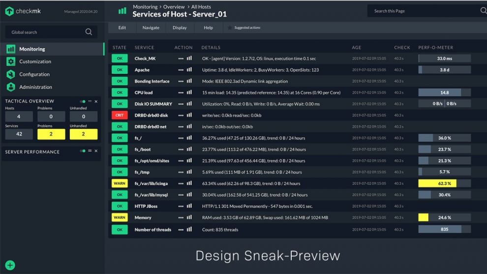
Mathias has outlined the four most important areas for simplifying the user experience. In terms of navigation in Checkmk, these are: an improved sidebar, improved context buttons, a display of where the user is, and a ‘super search’. Regarding the clarity of Checkmk, this means simplified pages and formats, clear naming and a fresh design, including icons.
With simplified and expert toggles for configuration menus, we want to ensure that the complexity for new Checkmk users is reduced. and at the same time make it possible for professional users to keep all of the usual functions and options – if they wish. In addition, all users should benefit from new main and application dashboards with new graphic types, such as histograms.

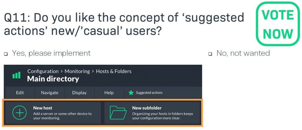
The conference participants also had the opportunity to vote on the technology previews shown in a demo by Mathias. Thank you for participating so enthusiastically. Your feedback helps us to align the simplified UX even more closely to the wishes and ideas of our users. In addition to voting for various options, the participants also had the opportunity to submit their own suggestions for improvements.
In the next blog you will learn of our plans for integrating Prometheus into Checkmk.

